After three months of building, the platform was feature-complete. The formulas worked. The screens rendered. The test suite passed. The senior partner workflows ran end-to-end. By any internal measure, the product was ready to demo.
But the layout had that feeling. The kind of feeling you get when you've looked at the same screens for too long and can't tell anymore whether they're clear or cluttered. Next buttons inconsistently placed. A navigation bar bearing the weight of twenty-one screens because we kept adding them. A flow that was logical for someone who built it and opaque for anyone who didn't. Great for testing, wrong for demos. The product needed a polish pass before the first client ever saw it.
The instinct was to ask an AI to evaluate it. The platform itself has AI integration - Gemini for content, OpenAI for embeddings, all the modern trimmings. Why not let the tools that wrote half the code evaluate whether the UX is coherent?
I've come around to thinking this is a bad idea, and the reasons generalise.
The builder's blindness problem
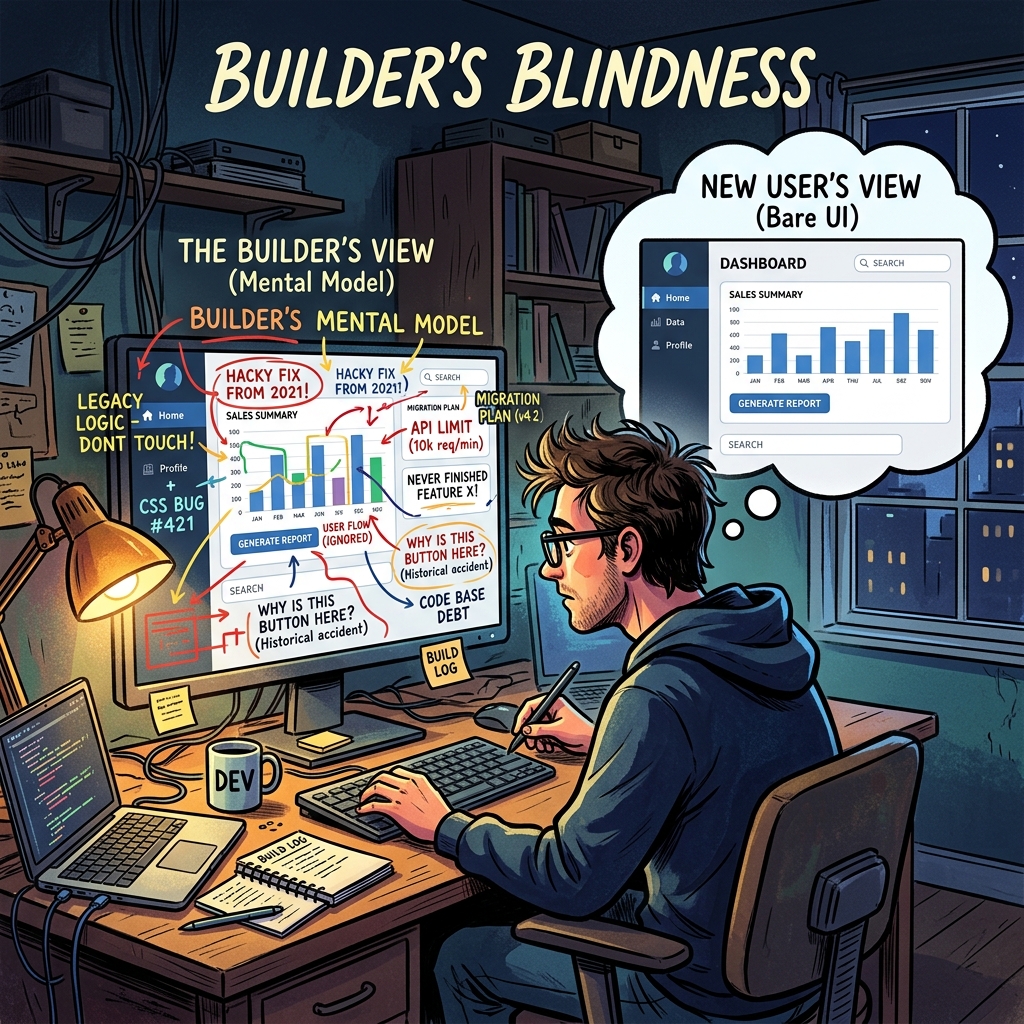
First, a confession about my own position. After three months of design decisions, I couldn't evaluate the product objectively. I knew why every screen was there, what it was supposed to show, what the user should do next. I could rationalise any design choice because I remembered making it. This is builder's blindness, and it's real. The person closest to the work is structurally the least qualified to evaluate whether it's usable by someone who isn't.
Builder's blindness isn't a humility problem. It's an information problem. I had context the user would never have: the reason that specific label is abbreviated, the history of why two similar screens exist separately, the intended workflow that the design assumed. I saw the product through the lens of its intended use. A real user sees it through the lens of their actual job, which is different.
The fix isn't for me to try harder to see the product fresh. I can't. The fix is to put the product in front of someone who sees it genuinely fresh and watch what happens.
Why the AI isn't a substitute
The AI evaluation option is tempting because it's fast and scalable. Feed the screen inventory to Claude, ask it to evaluate UX coherence, get a list of suggestions. Ten minutes. No scheduling. No feedback awkwardness.
Here's why it doesn't work. AI evaluation of UX requires context the AI doesn't have - not about the product, about the user. A usability judgement depends on what the user is trying to do, what they already know, what interrupts them, what the meeting they're about to walk into looks like, what their manager asked them yesterday. A senior partner evaluating a territory analysis with twenty minutes before a client call has a different usability need than one doing deep analytical work at 11pm. An AI reading a screen description can't model either scenario.
AI is very good at catching code-level issues: missing middleware, inconsistent label casing, accessibility violations, broken state transitions, security holes. These are pattern-matching problems with clear correct answers. Give Claude a pull request, it can audit the code against a list of patterns, and it will find real issues.
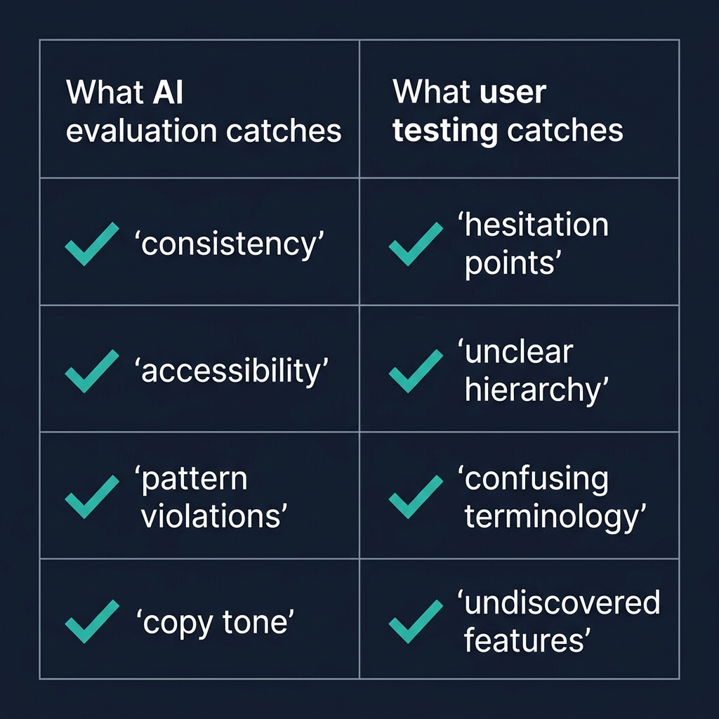
AI is structurally worse at the felt sense of a product. Is this nav bar overwhelming? Is this button's placement intuitive? Is the information hierarchy right for the decision the user is making? These questions require modelling a human in a specific situation, which AI can approximate but not actually do. The AI will produce plausible suggestions - the nav bar is overloaded, reduce from twenty to seven items, group by phase - and the suggestions will often be right but always generic. Right for the category of problem, not necessarily right for this specific case with its specific users.
The structured outside-in review
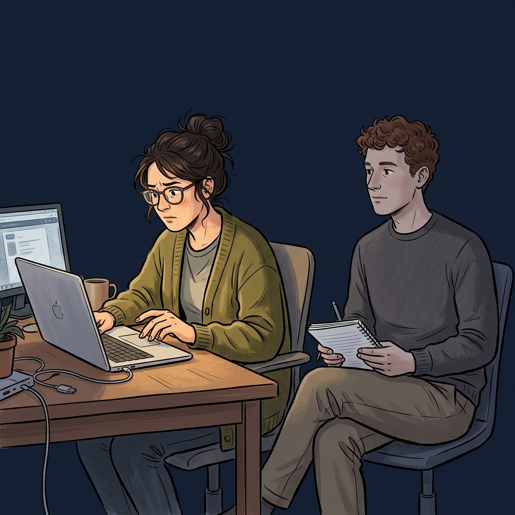
The highest-signal evaluation technique is embarrassingly low-tech. Find someone who understands the problem domain but has never seen the product. A former colleague from the industry. A consultant friend who does similar work. Someone the builder isn't in a hierarchical relationship with, so their feedback isn't filtered by politeness.
Brief them in one paragraph: "You're a senior partner at a consulting firm, onboarding a new client in Malaysia. The client sells lubricants. You've just opened the platform. Work through setting up the engagement for about twenty minutes." That's it. No more context. No guided tour. No "here's how the nav works". Let them figure it out.
Watch silently. Take notes. Don't prompt. Don't defend. Don't explain. The goal is to see where they hesitate, what they click, where they get lost, what they mis-interpret, what they think a button does before they click it. The first ten minutes will teach you more about your product's UX than three months of internal reviews.
The specific things to watch for:
Where do they pause? A pause is a decision point the UI didn't handle well. Either the next action isn't obvious, or they're trying to understand what they're looking at, or they're weighing options the UI isn't helping them compare.
What do they click first on each screen? If it's not what the design intended, the information hierarchy is wrong. The most prominent element isn't the most important element, or vice versa.
What do they say out loud? Users who think aloud (most do, if you encourage it) surface their mental model in real time. "Oh, this is where I set up the territory. Wait, why is there a thing called a scenario? Is that different from a territory?" The question about scenarios versus territories is exactly the thing you'd never notice internally, because you've been using both words for weeks.
What do they never do? Features they don't discover are features that aren't being surfaced. If twenty minutes in they've never opened the confidence cascade drill-down, the cascade is either not needed or not visible. Either is an actionable finding.
Why this beats any AI evaluation
The structured outside-in review captures the one thing AI can't: the reaction of a specific human in a specific moment, trying to do something real. The feedback is grounded in actual use, not in pattern-matching against general UX principles. The findings are specific to your product's users, not generic to the category. The tester's reactions carry information that can't be extracted from the screen descriptions the AI would see.
This is why the best product teams at serious software companies invest in user research beyond their scale - not because usability testing has massive ROI in a spreadsheet sense, but because the signal-to-noise ratio of five hours of watching a real user is unmatched by any other evaluation method. AI can augment the process (synthesising patterns across many sessions, catching accessibility issues, suggesting A/B test variants) but cannot substitute for the core activity.
When AI evaluation is actually useful
I'm not arguing AI evaluation is useless. It's useful for specific bounded questions:
Consistency audits. Given the design system specification, is the product consistent with it? AI can check this across many screens quickly.
Accessibility audits. Given WCAG standards, does the product comply? AI is good at this.
Pattern violations. Given the architectural conventions in the codebase, are new additions consistent with them? AI catches these reliably.
Copy reviews. Is the tone consistent across screens? Are there language inconsistencies (mixing "territory" and "region")? AI catches these.
These are all evaluations against explicit rules. AI is great at explicit rules. Where it fails is holistic judgement - does this feel right to a real user? That question needs a real user. Accept the division of labour and stop asking the AI to do the job the user is supposed to do.
The structural point
The pattern here - using the right tool for the right job, not the most convenient tool for every job - applies beyond UX evaluation. The temptation with powerful AI tools is to use them for everything, because they're fast and they produce plausible output. Plausible output isn't the same as correct output, and correct output for some questions requires a human in a specific situation that no model can simulate.
Know the questions AI can answer well, use it for those, and discipline yourself to find humans for the rest. The productivity gain from using AI correctly is larger than the productivity gain from using it everywhere. The second approach produces impressive-looking output that's subtly wrong in ways that aren't detectable until it's too late.
Put a real person through your product. It's the single highest-leverage twenty minutes in the entire build cycle.