The cleanest way to lie with data is to present every number with equal authority. Consulting decks do this by default - every figure in the same font, the same size, the same boldness, with footnotes so small they function as visual decoration rather than information. The reader has no idea which numbers are rock-solid and which are plausible guesses. Everything looks equally real, which means nothing is really trusted.
The fix is embarrassingly simple: make confidence visible.
The four-tier system
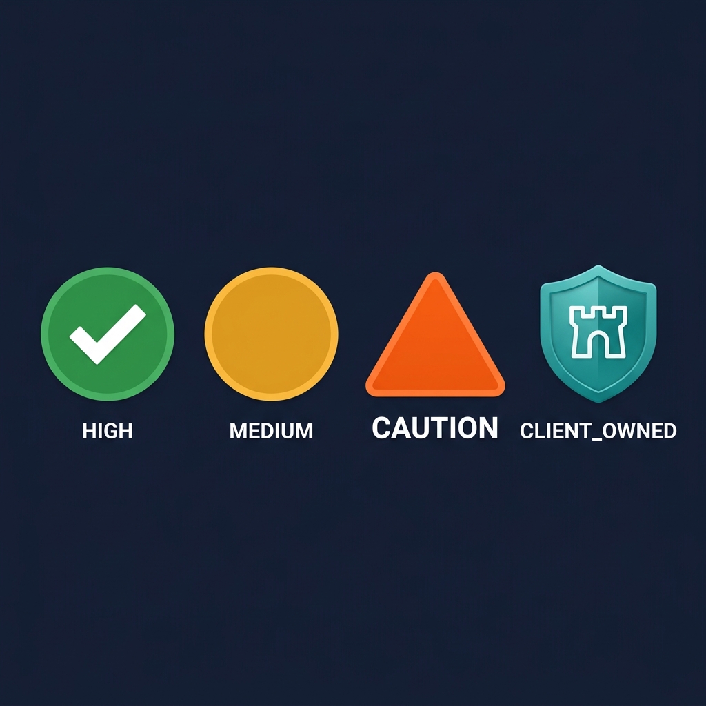
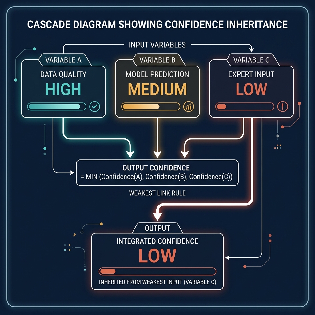
Every formula output in the platform carries a confidence badge. Four tiers: HIGH (green), MEDIUM (amber), LOW (orange, with an additional "CAUTION" label), and CLIENT_OWNED (a distinct teal badge for data the client has explicitly confirmed). The tier isn't cosmetic - it's computed. Every formula defines its inputs and declares how confidence inherits from them. By convention, a formula's confidence is the lowest confidence of its inputs. A territory attractiveness score built on field-verified outlet counts (HIGH), AI-estimated growth rates (MEDIUM), and unassessed channel exclusivity (LOW) is a LOW-confidence score. It doesn't matter that three of its four inputs are strong; the weakest input drags the whole score down.
This cascade makes confidence a first-class property of every output. It also makes it a workflow, not a disclaimer.
Why the cascade matters more than any individual badge
The interesting consequence of the cascade is that confidence becomes a roadmap. Open the platform, filter to LOW-confidence formulas, and you have a list of what needs to be improved. Each LOW-confidence output traces back to one or more LOW-confidence inputs. Upgrade those inputs - run the field research, get the client to confirm the data, commission the consumer survey - and the cascade turns amber, then green. The platform visibly becomes more trustworthy over time, and the path to trustworthiness is explicit.
A senior partner planning a mid-engagement data gathering session can use the cascade to prioritise. The field researchers' time is finite. Which three data points, if upgraded from MEDIUM to HIGH, would turn the most LOW-confidence outputs into MEDIUM-confidence ones? The question has a computable answer, because the dependency graph of formulas is explicit. The team can rank fieldwork by its impact on downstream confidence, not by guesswork about what seems important.
This is the workflow dimension. Confidence isn't a warning label you put on a chart. It's a queue of work the platform can help you prioritise.
The governance dimension
Confidence badges also change how the work is received. In a boardroom, a LOW-confidence figure visibly earns less weight than a CLIENT_OWNED one. The conversation shifts from "is this number right?" (which invites endless adversarial quibbling) to "what would it take to move this number to higher confidence?" (which invites problem-solving). The executive asking the question is now co-designing the next phase of work, not disputing the current output.
This reframing is surprisingly powerful. The traditional consulting posture - every number presented with full confidence, defended against any challenge - puts the consultant in an adversarial relationship with the client's scepticism. The confidence badge posture makes the consultant and the client allies against the epistemic limits of the available data. The consultant says "this is LOW-confidence because the field research for this archetype hasn't been done yet; we recommend commissioning it in Phase 2". The client says "agreed" or "we'll provide the data from our internal records instead, which would make it CLIENT_OWNED". Either outcome is productive. Neither is adversarial.
Why most software doesn't do this
Traditional business intelligence tools don't show confidence because their data is assumed to be uniform. The data warehouse is a database; the database is assumed to be correct. Confidence, in that model, is a data quality concern handled upstream of the BI tool, not a property exposed to the user.
This breaks down in any domain where the data is a mix of measurements and estimates. Consulting is the extreme case - almost every number is an estimate of something - but the same issue applies to sales forecasting, supply chain planning, strategic modelling, and any domain where the inputs are mixed quality. The BI tool that doesn't surface confidence is either hiding the mixed-quality inputs or treating them uniformly, both of which produce worse decisions.

Getting the confidence layer right requires a specific kind of discipline at data model design time. Every field carries a confidence attribute. Every formula declares how it inherits confidence. Every upgrade path is documented - what action turns this field from MEDIUM to HIGH? The discipline is more work upfront; the payoff is a platform that can be trusted in proportion to the trust the data deserves, and can tell you exactly where the trust is weakest.
The client reaction
The first time we showed a confidence-badged analysis to a client Regional MD, we expected pushback on the LOW-confidence flags. The opposite happened. The RMD leaned in - the badges were the first thing they looked at. Not because they wanted to dismiss the LOW-confidence findings, but because they wanted to understand what the work would look like in a quarter's time when the field research upgraded the weakest inputs. They could see a trajectory, not just a current state. They could budget for the upgrade, because the cost of moving specific inputs from MEDIUM to HIGH was explicit.
The paradox is that making uncertainty visible builds more trust than hiding it. A client who sees only confident numbers can't distinguish between the real and the performative. A client who sees confidence tiers understands that the consultant is being honest about what's strong and what's weak, which makes the strong stuff more credible, not less. The tier system is the opposite of a disclaimer. It's a credibility engine.
Applying the pattern beyond consulting
The pattern generalises. Any domain where outputs are computed from mixed-quality inputs benefits from an explicit confidence layer. Sales pipelines: which stage assessments are AI-estimated from recent activity versus explicitly confirmed by the rep? Financial models: which assumptions are historical data versus forward projections versus executive-set targets? Product usage analytics: which engagement signals are from instrumented events versus inferred from session boundaries?
The design work is identical in each case. Define the tiers. Define how confidence inherits through computations. Define the upgrade paths. Surface the tiers in the UI consistently. Let the cascade become visible. The result is a platform that's more honest, more useful, and paradoxically more trusted than one that presents everything uniformly.
Traditional software treats confidence as a data quality problem handled before the user sees anything. Vertical platforms that want to be trusted treat confidence as a first-class property, visible in every screen, shaping every conversation. The work is the same either way. The difference is whether the confidence stays hidden or becomes the most valuable feature in the product.